3.28.2011

Fraktur part deux

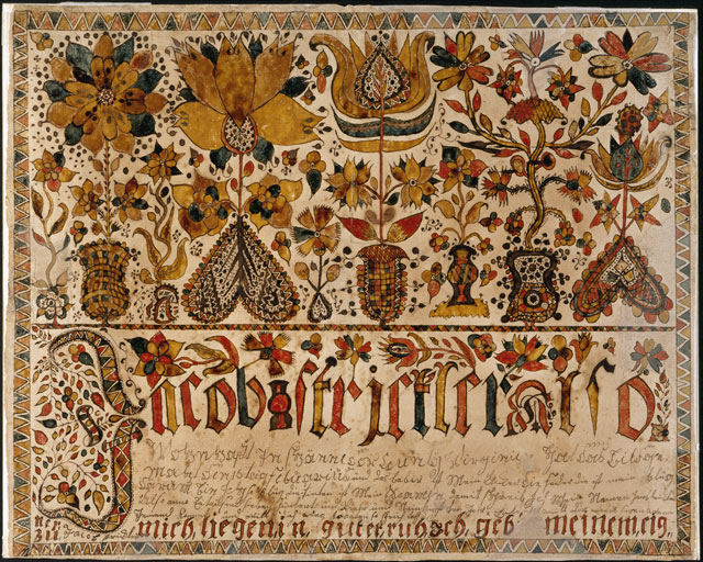
I finally got the chance to upload the couple of images I managed to get out of my fraktur class. I was really most interested with the lettering, and I wanted to make a couple cards with some ornately drawn names on them. The top one is for my boyfriend Nick, the bottom for my mom.

I was really trying to stay within the fraktur style here, but I did let a couple little things of my own creep in. I think I'll let this stuff subtly influence some future projects.

3.27.2011

Hipsters don't high five


a spot and half-page for a class assignment based on text from the Hipster Handbook.

and i have twitter now?

3.12.2011

Lettercult and Taufschein

Lettercult is an amazing website that focuses on custom lettering from around the globe. A few of pieces of mine (some alphabets, some wrestlers) are being listed on their site for their annual "Best Of"!

Check out the post here. I'm very proud to have my work be peppered amongst the beautiful images on display.

This morning I went to Lancaster, PA to take a class on fraktur, a decorative lettering and ornamentation style developed in the mid 1700s by the Pennsylvania Dutch.

I had a great time, but the class went by so quickly that I didn't get a chance to finish my fraktur. Look forward to a heathen's adaptation of Mennonite art in my next post!

3.03.2011

Doodlepage

Happy March, y'all. I've seen lots of people doing two-tone sketchbook experiments lately, so I think it's subconsciously influenced me. I kind of cheated, these little ditties are three color'd.

doodles